I would like to share with you a small tool I have discovered this year which is very useful; Violin Plot!
The Intro
Violin Plot
Violin plots are a nice tool that we can find in many different visualisation libraries. What do they do they show and compare distributions. It’s, in my own opinion a better way to compare distributions. Here is a quick example
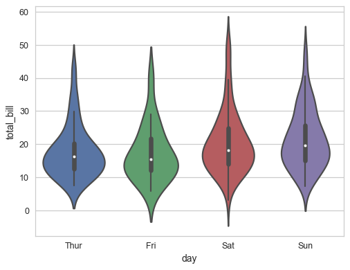
As you can see here you can easily compare the value from the for categories (Thur, Fri, Sat, Sun).
In a more precise way, the Violin plot is a mix of Box Plot and Kernel density plot
The Set list
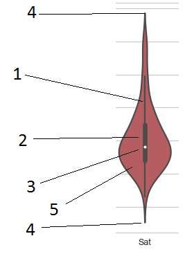
- The thin bar represent the 95% confidence interval
- The thick bar represent the second and third Quartile
- The white dot represent the Median (The value in the middle)
- Top and Bottom point represent your min and max
- The coloured area represent the density or the distribution of the population
The Masterpiece
I have used them for hyper-parameter tuning. When you do hyper-parameter tuning using grid search from scikit-learn you get a array of result. I you look simply at the absolute minimum, you can easily end up with an anomaly or a corner case. But looking at the tendance you can get a way better result.
- Value will tend to be better in general
- The sparse between good and bad will be smaller.
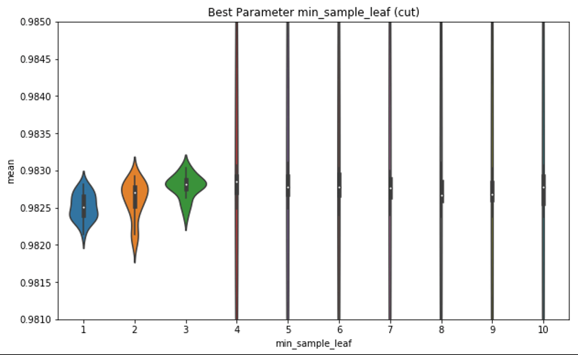
In the above picture it is clear that if you pick a value above 3, you end up with highly variable values. Even if you potentially can get a better result with one of the values > 3, you get no stability and the % chances you get something bad is big.
In this case the value 3 is very good because. First it is a better score than 1 and 2, but it’s also a lot more compact, thus you can expect a small variance in your results.
Where to buy tickets
You can get violin plot in most of the popular visualization libraries. Here is a short list:
- Seaborn: The one I have used in this article.
- Plotly: Another very popular lib.
- Matplotib: I do not like this one, personal taste.
- GGplot2: For R lovers 😉
The critics
In conclusion, this is a very nice tool when you need to compare distribution. I honestly think this tool is undervalued and underused.
Happy plotting,